New Homepage design


  • I find the huge gap between the title and the #Post very .. annonying. Now I have to move my had from totally left of my screen to totally right to read the latest post for each topic.

    0_1473707200319_upload-e392565b-9a45-4b00-a1c2-c708d567fbb6


  • Admin

    Haha, blame @Anticimex.

    He had the opposite complain. "Why the hell do we have all the un-used whitespace on the sides?"

    Let's start a flame war 🙂


  • Well .. I can partly understand this but .. I don't want to move my head either 😄

    I am not "pro" at web design but I would expect the most important part of a side centered in the mid .. not scattered over all the screen.

    @Anticimex: scold .. give us the old design back!!! At least the part with narrow spacing.


  • Contest Winner

    @cimba007 modern displays are tiltable. If you have a too wide screen for your comfort, turn it 90 degrees. Problem solved. Or don't use a too wide screen for your comfort 😉


  • I think you just have to use an old laptop like mine T60, then it all looks great. I think it's because you have those new fancy wide screen top models 😉

    0_1473708218635_mysensors_web.png


  • EDIT: Still you have this huge space in the middle and on the right side the text is wrapping ...

    Tilt my screen! Genius idea!

    But what will I do on .. like all the rest of the internet that have designed their pages the other way around?

    I am using "defaultish" 16:9 1920x1080


  • Contest Winner

    @cimba007 then resize the window. Assuming you are using a windowing os... Windows offers some nice keyboard shortcuts for sizing and aligning windows. If you use Linux, then you can do whatever you want. If you use a mac, then "baaahahahaaaaa".


  • .. lets stay serious .. I don't know a sigle site on the interweb that is splitting the important stuff of the page to the left AND right side. It defies all ergonomical logic and in my oppinion is much worse then before.

    If something is working ... why change it? Just because there is so much space on modern screens dosn't mean you have to arbitrarily try to fill it with some content.

    I just picked 3 of the mayor forum software providers by random choice and they all have like

    3-6-3 with their designs .. meaning 25% free space to the right and left of the screen.

    http://www.vbulletin.com/forum/
    http://www.try-phpbb.com/31x/viewforum.php?f=2&sid=7b6920e75c920daf0d22f90f466ad94a
    https://community.woltlab.com/

    Woltlab is filling the right side with some more general stuff .. still all have the same scheme.


  • Contest Winner

    @cimba007 well then let's agree to disagree. I detest designes that waste screen real estate. For the forum I don't really care but if I get a vote on the main site it is to avoid squeezing the left hand side menu just because the design require everything to be squashed in the middle, line breaking topics just because they are wider than the artificially induced narrow design. That is just retarded.


  • Admin

    When designing the new site, there were a few things I had to consider. leading up to how it looks today.

    1. For newcomers (coming directly to the forum from some google search) should have the main sites menu at the top (so they could seek information themselves more easily)... and the top menu should be as minimal as possible (not wasting valuable space)... And I couldn't mess too much with the forums build in menu.

    2. Main site: We needed some kind of scrollable left menu that could hold a growing number of sub articles. With enough horizontal space to give proper titles. So I had to switch to a bootstrap fluid container (which behaves a bit differently but gives full page width).

    3. Moving between forum <-> main site should feel natural. Which meant switching to the fluid design here as well.


  • @Anticimex

    You just made a point .. ever wondered why books are not printed in landscape? Because moving the eys from the right most side to the left most sides is a hassle and stressfull.

    @hek

    Point 1: I really like the idea of having the forum and main site menu united.

    Now the important stuff is also split. Categories, unread .. and most popular on the left .. search and notifications on the right .. why not move all to the same side?

    Point 2: I like the left menu. Nothing to comlain here.

    Point 3:

    0_1473709725733_upload-4d44163d-44d7-409e-a946-d3237e951a05

    Switching between the "starting page" and the "forum" now looks like a mayor break in the design flow

    0_1473709774978_upload-7106b808-c93e-445d-bf98-e9bdd35873a5

    PS: The main page design is much more flexible with different sizes. If the monitor is smaller .. just take from the free space (left and right) .. if the monitor is bigger .. well .. some more free space .. nice.

    But with the forum it is totally different. Pinning the content to the left and right space gives a different user experience depening on your resolution.


  • Contest Winner

    @cimba007 I tilt my screen when I read documents. Just like a book. So yes, I agree with you. And regarding the left hand menu, you like it because it is not squeezed. This is what it used to look like:
    0_1473710320707_Pasted image at 2016_09_04 19_36.png


  • So why not leave it and maybe add another 5-10% more space?

    Or .. if you are in the mood to experiemnt .. why not add the menu to the right? This would allow it to take as much of the free space it needs.

    To make this clear .. I am not saying "the new design is bad because .. reasons" .. I can only report my impression of as a user of a "big" screen (24" @ 1920x1080) and can say it feels awkwars when the content is split all over the screen .. having to constantly move my eyes over a large distance as the "relevant" and "important" functions are now split more then nessesary.


  • Contest Winner

    @cimba007 @hek fine by me. I take issue with a width that forces line breaking of menu entries when not required by physical limitations. And the old design did. Hence my complaint that it was too narrow for comfort.
    And since I presume you use a mac (with its ridiculous window manager) let's meet in the middle, widening the design enough to accommodate reasonable long article titles for the left hand menu without line breaking while permitting people that for various reasons don't want or can't tilt the display nor resize the browser.


  • I like your idea 😉 and I totally agree that breaking lines when there is enough space is not a good design.

    And .. I would never ever use a mac 😉

    And you are right .. I can't tilt my screen and I am not willing to change my browser size for one tab out of ~25.

    Even if it might be obvious .. if the title is too long to fit the layout .. maybe choose a shorter, more concisely title 😉


  • Admin

    A few % side-padding here on the forum wouldn't hurt.

    I'll see what I can do with the forum menu with a simple css hack (as I would like to keep away from doing my own theme).


  • Contest Winner

    @cimba007 as you can see from my picture, judging by your standards "advanced build options" would then be a too long title, and if that is the case, we would need to provide an on screen legend to explain all the abbreviations we would have to use just to keep the menu "sane". And then we are into really bad page design 😉


  • Admin

    Regarding menu.. Is this better?

    0_1473711480060_Screen Shot 2016-09-12 at 22.17.13.png


  • Contest Winner

    @hek not sure, menu for me is the main site vertical list of topics. The forum layout I don't really mind as I can zoom the page to make it more appealing to me even if you revert back to the old layout. But in the main site, zooming would not help as the contents was forced to adapt to the layout.


  • Yeah .. "advanced build options" should in every case fit there 💃

    @hek: If this is your "real" screen size I can totally understand why this is no issue for you at all 😄
    It looks a "little bit" packed but still much more accessible then splitting. I want to search? Top right corner .. I want to read the most recent message? Top right .. wanne check download area? Guess what ..


  • Admin

    I could add some padding between the two lower sections.. just a sec, lets try it.


  • Admin

    5% padding added (not sure how much it helps on your screen though) and moved menu to the right.


  • I would be more happy with 10-15% but I think I can live with it. Would be even more awesome if this could be set as a "preference" on a per user basis .. but this would be too much to ask 🙂

    PS: Can u tell me where you have added the padding? (in the css file?!)


  • Admin

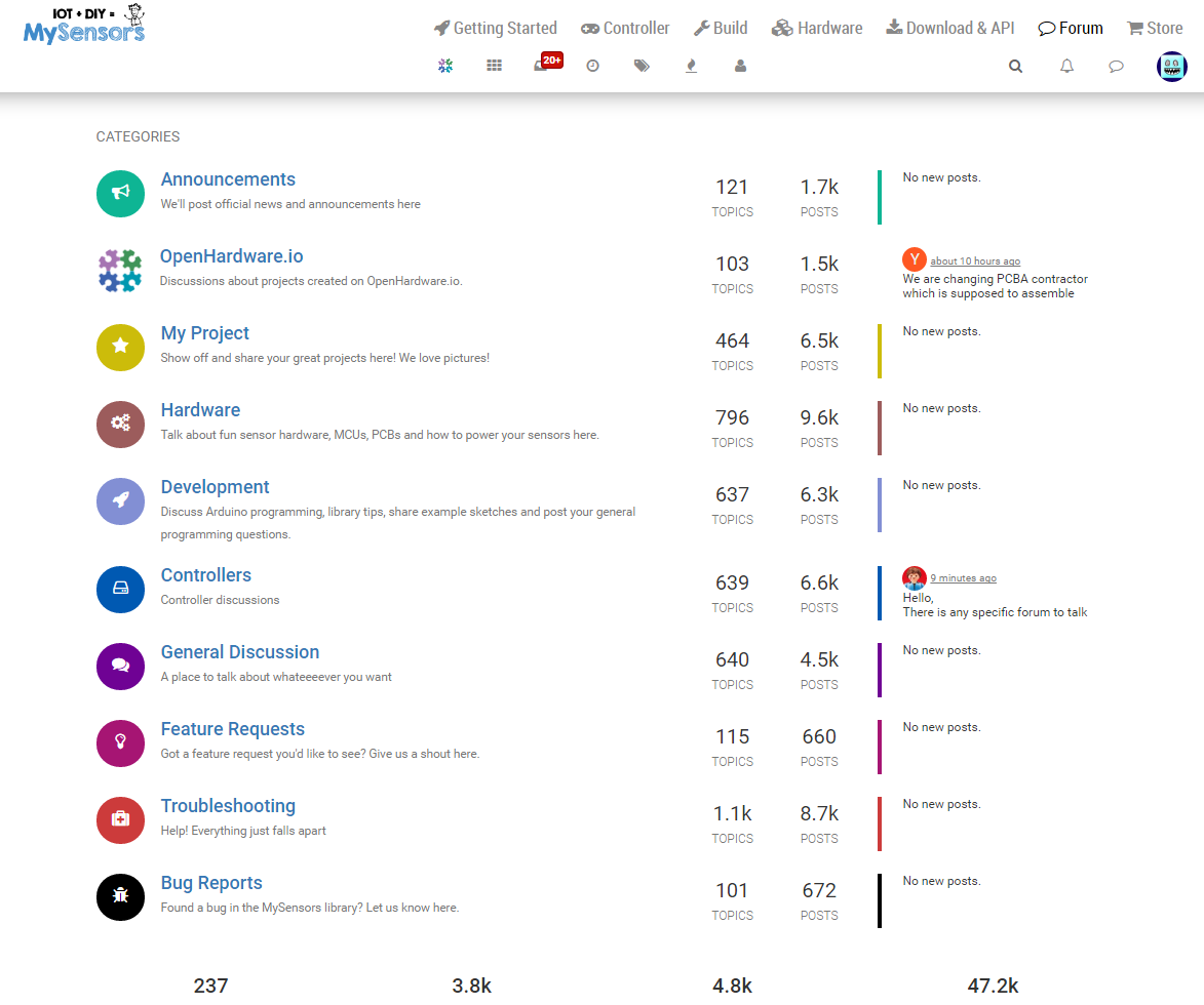
    10% och each side is way too much on smaller screens.

    You'll have to greasemonkey in your padding changes on the #content div.

    Or simply remove the width: 100% !important on it to get the old behaviour back (but that also affects the menu... which might not a problem for your screen size).


  • @hek said:

    #content div

    Yep .. I am just heading for greasemonkey


  • 0_1473714214844_upload-67990b46-8f96-44e7-9ecf-f795209acf1c

    This is just "balm for the eyes" .. I can absolutelty life with tinkering with greasemoneky 😉


  • Admin

    Haha, have fun redesigning sites 😉


  • Contest Winner

    @cimba007 @hek and it was much rejoicing


  • Sorry for stirring up so you guys at this late hour .. but .. I only strive to improve mysensors (with my stupid comments and ideas :D) as I really like the library, the controller, the site 😉


  • Admin

    No problem, feedback is always appreciated!


  • Well .. overwriting an !important doesn't seem to be this easy .. 😄

    The best I could come up with:

    // ==UserScript==
    // @name         New Userscript
    // @namespace    http://tampermonkey.net/
    // @version      0.1
    // @description  try to take over the world!
    // @author       You
    // @match        https://forum.mysensors.org/*
    // @grant        none
    // ==/UserScript==
    
    function addNewStyle(newStyle) {
        var styleElement = document.getElementById('styles_js');
        if (!styleElement) {
            styleElement = document.createElement('style');
            styleElement.type = 'text/css';
            styleElement.id = 'styles_js';
            document.getElementsByTagName('head')[0].appendChild(styleElement);
        }
        styleElement.appendChild(document.createTextNode(newStyle));
    }
    
    (function() {
        'use strict';
        // Your code here...
        addNewStyle('.container { width: 55% !important;}');
        //$(".container").removeAttr("width");
    })();
    

Log in to reply
 

Suggested Topics

  • 4
  • 14
  • 9
  • 933
  • 5
  • 1

0
Online

11.2k
Users

11.1k
Topics

112.5k
Posts