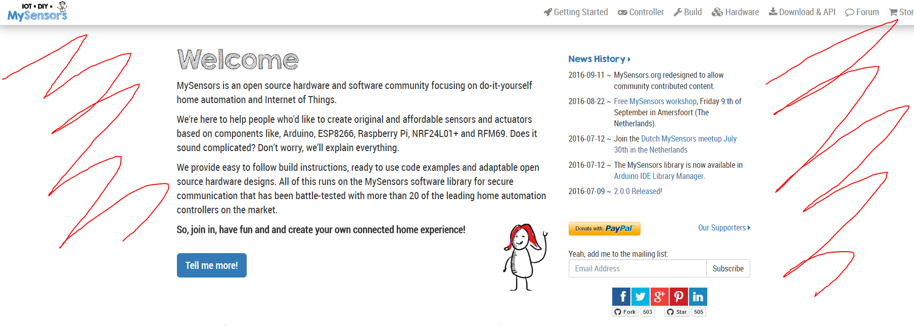
New Homepage design
-
When designing the new site, there were a few things I had to consider. leading up to how it looks today.
-
For newcomers (coming directly to the forum from some google search) should have the main sites menu at the top (so they could seek information themselves more easily)... and the top menu should be as minimal as possible (not wasting valuable space)... And I couldn't mess too much with the forums build in menu.
-
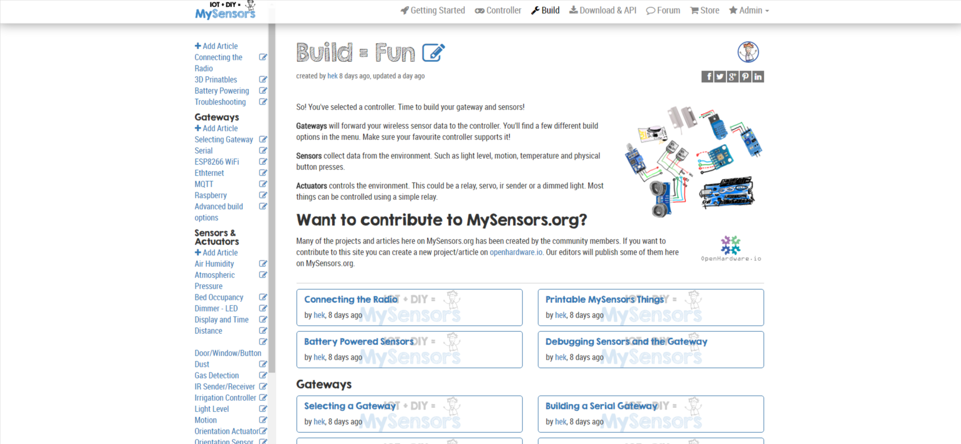
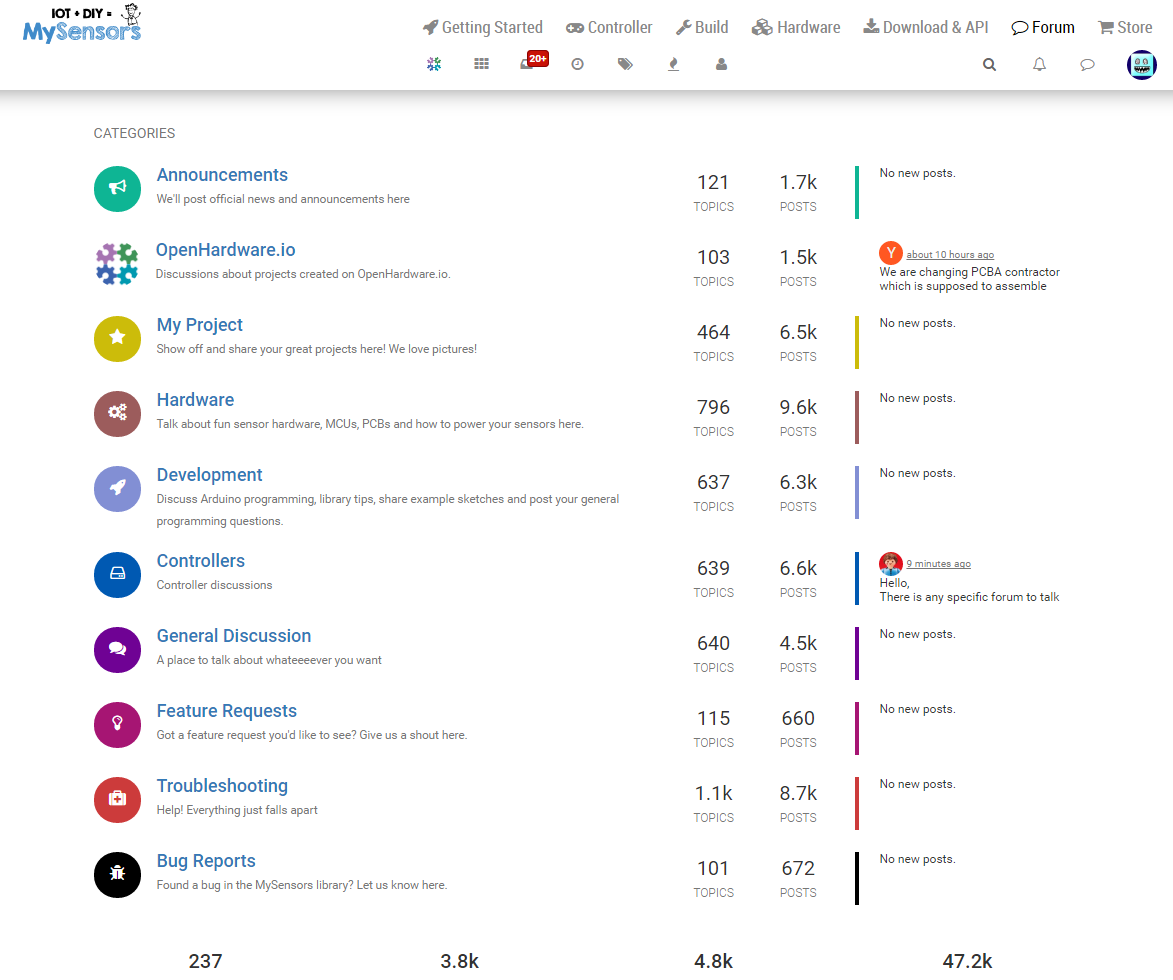
Main site: We needed some kind of scrollable left menu that could hold a growing number of sub articles. With enough horizontal space to give proper titles. So I had to switch to a bootstrap fluid container (which behaves a bit differently but gives full page width).
-
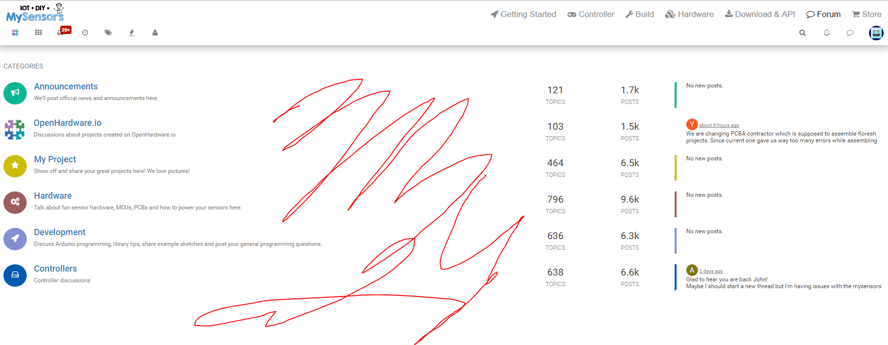
Moving between forum <-> main site should feel natural. Which meant switching to the fluid design here as well.
-
-
EDIT: Still you have this huge space in the middle and on the right side the text is wrapping ...
Tilt my screen! Genius idea!
But what will I do on .. like all the rest of the internet that have designed their pages the other way around?
I am using "defaultish" 16:9 1920x1080
You just made a point .. ever wondered why books are not printed in landscape? Because moving the eys from the right most side to the left most sides is a hassle and stressfull.
Point 1: I really like the idea of having the forum and main site menu united.
Now the important stuff is also split. Categories, unread .. and most popular on the left .. search and notifications on the right .. why not move all to the same side?
Point 2: I like the left menu. Nothing to comlain here.
Point 3:
Switching between the "starting page" and the "forum" now looks like a mayor break in the design flow
PS: The main page design is much more flexible with different sizes. If the monitor is smaller .. just take from the free space (left and right) .. if the monitor is bigger .. well .. some more free space .. nice.
But with the forum it is totally different. Pinning the content to the left and right space gives a different user experience depening on your resolution.
-
So why not leave it and maybe add another 5-10% more space?
Or .. if you are in the mood to experiemnt .. why not add the menu to the right? This would allow it to take as much of the free space it needs.
To make this clear .. I am not saying "the new design is bad because .. reasons" .. I can only report my impression of as a user of a "big" screen (24" @ 1920x1080) and can say it feels awkwars when the content is split all over the screen .. having to constantly move my eyes over a large distance as the "relevant" and "important" functions are now split more then nessesary.
@cimba007 @hek fine by me. I take issue with a width that forces line breaking of menu entries when not required by physical limitations. And the old design did. Hence my complaint that it was too narrow for comfort.
And since I presume you use a mac (with its ridiculous window manager) let's meet in the middle, widening the design enough to accommodate reasonable long article titles for the left hand menu without line breaking while permitting people that for various reasons don't want or can't tilt the display nor resize the browser. -
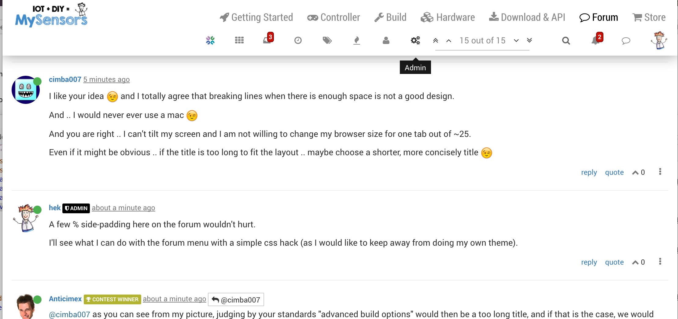
I like your idea ;-) and I totally agree that breaking lines when there is enough space is not a good design.
And .. I would never ever use a mac ;-)
And you are right .. I can't tilt my screen and I am not willing to change my browser size for one tab out of ~25.
Even if it might be obvious .. if the title is too long to fit the layout .. maybe choose a shorter, more concisely title ;-)
-
I like your idea ;-) and I totally agree that breaking lines when there is enough space is not a good design.
And .. I would never ever use a mac ;-)
And you are right .. I can't tilt my screen and I am not willing to change my browser size for one tab out of ~25.
Even if it might be obvious .. if the title is too long to fit the layout .. maybe choose a shorter, more concisely title ;-)
@cimba007 as you can see from my picture, judging by your standards "advanced build options" would then be a too long title, and if that is the case, we would need to provide an on screen legend to explain all the abbreviations we would have to use just to keep the menu "sane". And then we are into really bad page design ;)
-
@hek not sure, menu for me is the main site vertical list of topics. The forum layout I don't really mind as I can zoom the page to make it more appealing to me even if you revert back to the old layout. But in the main site, zooming would not help as the contents was forced to adapt to the layout.
-
Yeah .. "advanced build options" should in every case fit there :dancer:
@hek: If this is your "real" screen size I can totally understand why this is no issue for you at all :D
It looks a "little bit" packed but still much more accessible then splitting. I want to search? Top right corner .. I want to read the most recent message? Top right .. wanne check download area? Guess what .. -
I would be more happy with 10-15% but I think I can live with it. Would be even more awesome if this could be set as a "preference" on a per user basis .. but this would be too much to ask :)
PS: Can u tell me where you have added the padding? (in the css file?!)
-
10% och each side is way too much on smaller screens.
You'll have to greasemonkey in your padding changes on the #content div.
Or simply remove the width: 100% !important on it to get the old behaviour back (but that also affects the menu... which might not a problem for your screen size).
-
10% och each side is way too much on smaller screens.
You'll have to greasemonkey in your padding changes on the #content div.
Or simply remove the width: 100% !important on it to get the old behaviour back (but that also affects the menu... which might not a problem for your screen size).
-
This is just "balm for the eyes" .. I can absolutelty life with tinkering with greasemoneky ;-)
Hello! It looks like you're interested in this conversation, but you don't have an account yet.
Getting fed up of having to scroll through the same posts each visit? When you register for an account, you'll always come back to exactly where you were before, and choose to be notified of new replies (either via email, or push notification). You'll also be able to save bookmarks and upvote posts to show your appreciation to other community members.
With your input, this post could be even better 💗
Register Login